
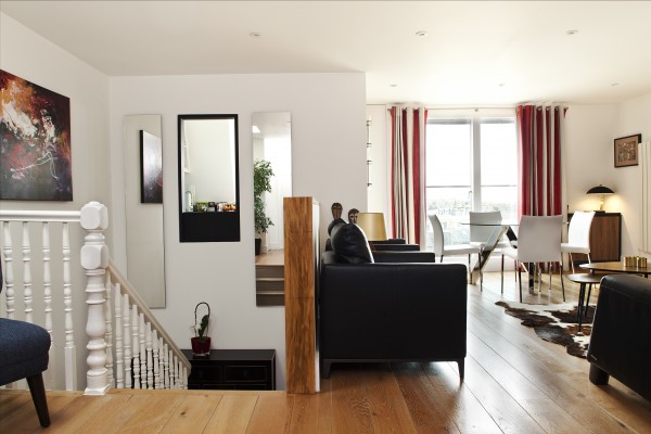
Open Plan area
Many of us have discovered that leaving home in the morning 5-10 minutes earlier makes a huge difference to how we save time or make the most of our day.
But it is not just in regard to time that a small change of direction can have a tremendous influence on what’s to follow.
It happens in meetings when finding the precise word to help us make the point; it happens in business when we take just the decision to trigger the desired outcome.
When I was studying physics in high school I understood this point in a graphic way when the teacher asked us why a grain of sand can break the front window of a car. The answer was speed; it was not about the size, it was about the impact that one small thing will have when speed is added to the equation.
In the world of ideas and design we can apply this simple thought, a worthy outcome is not necessarily about the big changes it is about the right ones, those that make a positive “impact”.
In that spirit I would like to share with you images of a project I finished recently where the client asked me exactly that: not big changes but a great impact. The brief was:
_I want to improve the look of the social area of my home with the minimum amount of building work possible, if none.
_I want to keep the spacious feel open as it is now.
_I want to keep the wall unit, my dining table and one of the sofas.
_I want to be able to walk from area to area with comfort and confidence.
_I want space for my books which can be included in a working area within the floor plan layout.
There are three areas I would like to show you, and how the changes occurred:
Landing

Landing: before
The landing is extremely important in this flat of one level, as you have access to the space through an internal stairs.
Above the landing there is an opening in the wall which allows the owner to have visual control of what is going on, hence that opening, which I had to keep, is an important focal point.
I took 3 decisions.
I have kept the opening exactly as it is in size but installed a frame, which will add character to it. The design of this frame will allow me to hide items like the bin, behind the wall. I chose black, as it is a colour the client likes and which allowed me to create a balance with the predominance of white in the flat without adding more colours.
Secondly, flanking the opening I proposed two big vertical floating mirrors, in this way I incorporated the landing into the scale of the open plan adding sophistication to the entrance: the landing becomes the lobby of the flat. This is reinforced by a black Chinese cabinet.
And third, I replaced the bookshelf that divided the stairs form the living area with a small wall in plasterboard and hand rail in oak achieving a sense of privacy and then surprise when you discover the open space once upstairs.
Living and dining area

Living area: before
There was not a lot of room to play with in terms of the location of these two areas, however I proposed to enhance them giving to each of them its own space.
In the dining area I placed the dining table exactly in front of the door/window that leads to the small balcony, as a lot of light comes from it and considering the table is in glass and chairs in white, I proposed a curtain with a strong colour so it frames the table and the view, bringing stability to the social area.
I proposed a striped fabric in a warm colour playing with the colour of the wall unit without being “obedient” to it. In the niche at the corner I added a small cupboard which serves the dining area.
In the living space the first decision was to drop the top wall unit 15 cm, as it was too high, the second was to keep the bigger sofa and place it against the only long wall and above it a painting, so as to create another focal point.
I proposed 2 armchairs against the new built small wall placing a side table and a table lamp on it so as to create a secondary more intimate space.
As the layout created was not symmetrical due to the wall unit already in place, the sofa was constrained to the longest wall and the armchairs against the small wall, thus to facilitate the transit from the bedrooms to the kitchen. I decided to propose a cowhide and a nest coffee table, helping to harmonise that asymmetry. Their organic shape allowed me to achieve this.
Browns, black and white were the colours of choice (in order to keep the colour palette at a minimum).
A Floor table lamp was added to the corner between the sofa and the wall unit.
The final touch was adding art on the walls, some of which the client already had.

Living area: after
Reading Area

Reading area: Before
There is a very nice space between the balustrade of the stairs and the access to the bedrooms; instead of creating a studio in this area I suggested that the client should have a reading area there, as the proportion was correct and also due to his love for his books.
In order to keep the eerie feel of the space (open plan) I proposed floating shelves in black, a comfortable reading chair without arms and a side table.
The client has a wonderful small tree so I incorporated it into the composition so that it adds warmth and creates a sort of special secluded space.
The skylight above the armchair makes reading very pleasant, the space being full of light with the plant, happy in its setting.

Reading area and Landing: After
As you can see none of these changes were big ones, but they have brought to the client a new understanding and enjoyment of his home, and that is the ultimate goal of interior design.


