
Every year since 2000, the Serpentine Gallery has commissioned in summer a temporary pavilion by an architect who has not completed, at the moment of the Gallery’s invitation, a work in England.
This year the design is from the Spanish practice Selgascano Architects.
Since 2009 I have visited the different pavilions looking to have an experience in architecture. I try to understand how each pavilion approaches the elements that are associated with the discipline, how they are defining, redefining or challenging them: volume, structure, interior-exterior relations, “the place”, the internal space, its relationship with the user, scale, proportion, technology, how it sits on the plot, materials, the relationship with its context and finally its artistic value.
This year the pavilion has been a huge disappointment. For me it is like a circus, it can entertain you with the use of bright colours and funny shapes but beyond that it seems there is nothing relevant or outstanding.
My background being architecture and my profession Interior design, it is very important for me to understand architecture, not just from the point of view of its relation with the outside world, but how it creates spaces that can be used and enjoyed by the users.
In this sense I asked to myself what this pavilion is teaching me about interior design. I found 5 points. If you have not visited it yet, please do, and check them out, I can be right, I can be wrong, probably you can find more, or be more relaxed about some or all of them. After all interior design and architecture has to be experienced to be understood. A building or any interior that is photogenic is not necessary synonymous with quality, as this pavilion teaches us.
Not everything that shines is gold
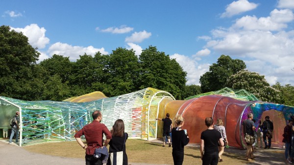
Are we getting immune to subtlety and to a beautiful rhythm as chaos and ugliness seem to be more noticeable? is what shines more have a higher value than serenity and harmony?
In a world saturated with images sometimes objects / spaces / architecture are created just with the ultimate goal of standing out… it becomes the beginning and the end. Interior design is not about luxurious materials, use of bright colours, rich fabrics, etc…it is more than that…it is about the understanding of the space, the functions and the sensibility of the occupants…all that translated and shaped by the objects and materials chosen.
Detailing says more than a thousand words
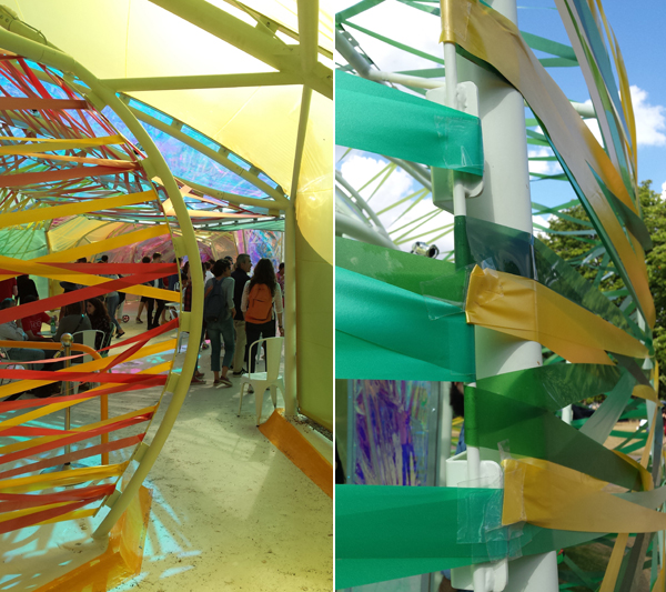
One of the biggest challenges in any kind of construction: architecture, furniture, jewelry, etc are the details..the transition between one material and another.. is not this one of the saddest transitions? tape for holding materials.
Interior design is an experience we have when we are there in the space, surrounded by the objects, finishes and materials.Our eyes move from one point to the other making sense of it all. It is in the nice detailing of those objects and surfaces where our eyes are going to make the transition from one to another in a smooth and beautiful way. Taking care of the detailing is going to make of that journey a better one.
A junction does not make a space to stay

The definition of a space to stay is defined for the relation between it and the access to it plus of course the consideration of human scale. Does this space invite you to stay or just to be a passer by?
A while ago I wrote a post on the importance of understanding your floor plan layout for creating spaces to stay and spaces to move (circulation). If many “corridors” lead to the same point, depending on the size and proportions of this space it can create different effects: if too small it is going to feel like a part of the corridors so when all of them converge on to it the logical consequence is chaos. If too big the sense of scale and proportion can make you feel isolated and targeted by all the corridors. The relation between spaces that serve and those that are served has to be the right one.
The use of colour

Color can bring harmony to the appearance of what other wise chaotic scheme but it does not save the scheme.
Can one abuse in the use of colour? Definitely you can. How do you know where to stop? This is a difficult answer as it depends on many factors: your cultural background, the use of the space and the time you are going to spend in that space. Colour can deceive the eye and the mind if just immediate gratification is to be sought. So thinking on what is important and for how long will help you to choose the right colour scheme.
Cheap materials are cheap materials
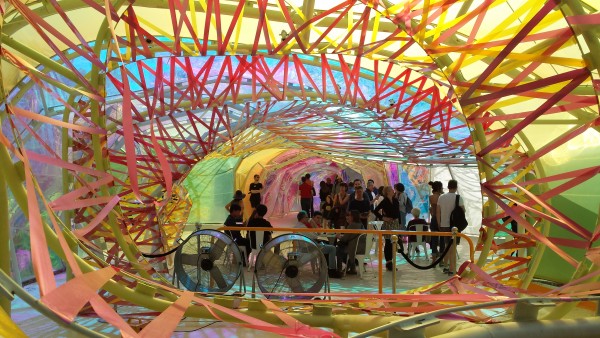
Using cheap materials is possible but you need to consider where, how it is going to be exposed, treated, etc. After not more than 2 weeks and the strips of plastic are falling apart. Cheap material? or cheap solution?
Honesty is one of the most important values in many areas and in interiors certainly it is greatly appreciated and noticed. If you have to choose cheap materials be aware they are cheap materials, don’t fool yourself. Now accepting them and understanding their limitations can help you to achieve a better outcome, a dignified one. Forcing a cheap material to behave in opposition to its nature is proclaiming not just its poor performance and quality but a lack of attention to detail and ignorance.


