

When one designs for a commercial project there are two objectives in mind, one that aims to satisfy the client’s brief and the other that constantly imagine the customer experiencing the space, feeling it, getting inspired by it and finally making him/her wants whatever that space has to offer.
When Apple & Eve contacted me for helping them with the refurbishment of their beauty salon, their brief was to offer a fresh, modern look that appeal to women and men.

There were certain challenges like: relatively small rooms, need of displaying beauty products, consideration regarding materials as wax can damage surfaces easily, etc.
When I saw the five treatment rooms, I notice there were a lot of elements on the walls: air condition units, small doors to access storage, radiator units, ventilation grills plus the normal switches and sockets.
If to this it is added that the height of the ceilings is low in most of them and that a small basin unit per room has to be attached to one of those walls the space become even busier.
My proposal to reduce the impact of all these elements was to use a dado rail which would create a visual distraction and add a special aesthetic to the rooms.
As the rooms are used for facials, massages, waxing, etc offering a relaxing, embracing atmosphere was key, darker colours helped to achieve this. Light textured wallpaper was used above the dado rail and painting bellow.
Porcelain tiles were chosen as easy to maintain and very resilient. A wooden look like effect added warmth to the feel of the rooms.
Ceiling and wooden work was painted white so the fresh touch was present.
All the furniture was supplied by a beauty salon furniture manufacturer.
For the public areas: reception, waiting area, pedicure and manicure the criteria was to use a wallpaper from ceiling to floor similar colour scheme of that used in the rooms but with a palm pattern in it which gave the feminine touch and added interest to the walls when, for example, the clients are getting their manicure/pedicure done.
The porcelain tiles in these areas were lighter so to accentuate the dynamism of them.

There was an important need for displaying products but the space was limited. My proposal to solve this requirement was to design built in units to be inserted in the wall by the area of main transit: one of them for products, the other for nail varnishes. Led light was incorporated so the products can be clearly seen and the colours appreciated.

In the reception area the pendant lights, feature wall and colour scheme was chosen following the brand colours.

The pendant lights above the pedicure/manicure area add emphasis and charm to the beauty of the wallpaper.
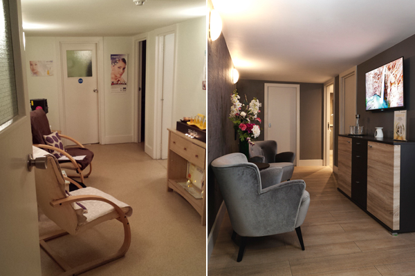
In the waiting area downstairs, the same criteria was followed but due the low ceiling wall lights were suggested.
As this space prepares the client to go the treatment room the light is subtle and there is a Monitor that constantly shows images of nature with a relaxing music as a background.
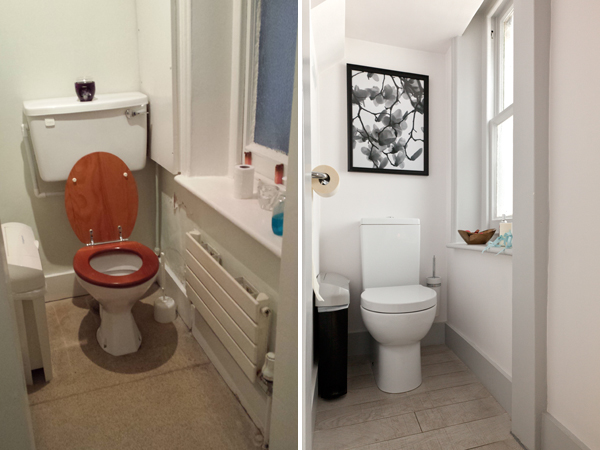
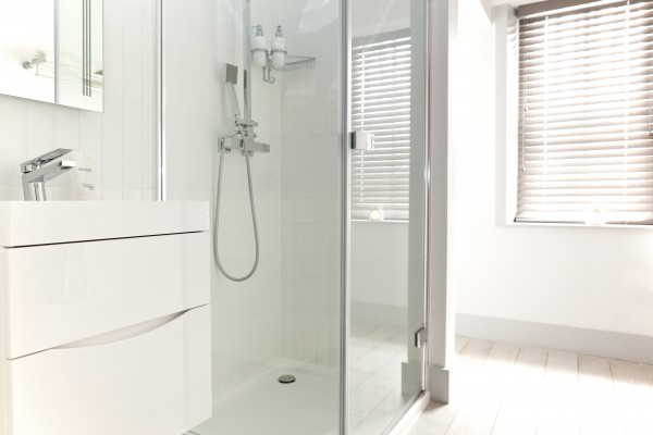
In contrast kitchenette and bathrooms were designed considering shades of white. This was proposed so the customers after the treatments feel the freshness and somehow help them to embrace the new them.
Finally it was proposed due the importance of nature in the name of the salon to use images of flowers, choosing one colour per room.
After some months of the project being finished I’m very grateful as the client has expressed their satisfaction with the spaces and how they help customers to feel pampered and being taken care of.
After a project is finished it becomes a living creature, one that needs to be looked after and that certainly will answer to the changes the users impose on it.


