
Colour surrounds us; it is so embedded in who we are as human beings that sometimes we forget how powerful it can be in defining situations, memories, places, feelings or even time.
We take colour for granted and because we move constantly from one point to another we do not realise the continuum or the fragmented effect colour has in our experience of the world.
Colour is extremely complex: relating to culture, climate, fashion, emotions, our sigh, our psychological state etc.
Because colour can generate, recreate or transmit a huge variety of emotions and perceptions it is an invaluable and always useful tool in developing concepts for interiors.
This is why choosing the right colours can be a challenging task.
In this sense, I would like to share with you an example of how I chose the colour scheme for the loft of a house in West London and what elements helped me to create that scheme. Hopefully this will give you some ideas on how to approach the project.
Firstly the context:
Key points for the most important floor in the house
_For the ground floor the space is open plan; the client wants a modern look even though some of the pieces to be kept are period ones.
_It is important to keep the balance between elegance and informality.
My understanding of the client
Having worked with the client three times before I know how important it is for them to have spaces that can be easily associated with elements of British tradition or taste.
These aspects were, primarily, the genesis when thinking of the colour scheme for the loft; this was the sequence of thoughts and decisions:
_The loft is a small area composed of a bedroom and an en suite bathroom
_It will be one of the guest bedrooms
_Being small and at the top of the house the client wanted to make the most of natural light.
_Knowing the feel and look of the main floor was going to be modern with elements of British traditional, I proposed to invert this approach in the loft: A traditional look with just a touch of modernity in the bedroom.
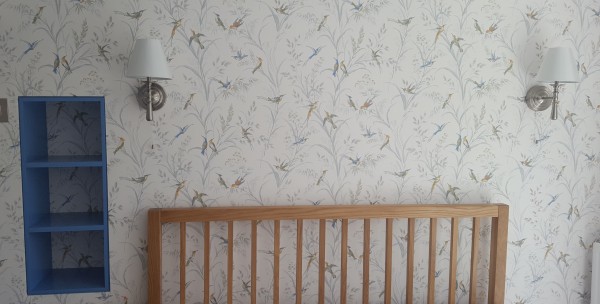
_The element that embraced the traditional look was the wallpaper (wallpaper with a pattern of birds came to my mind). This wallpaper I chose carefully, so as to maintain the brightness of the room and a neutral gender appeal). The colour scheme was developed thanks to the wallpaper: Greys and blues.
The traditional feel of the room was accentuated by choosing period furniture in wood and lights.
The architectural elements: architrave and skirting are modern in look and design, the same applies to the built in furniture. Those were painted in white for reinforcing the bright interiors.
The use of colour for the built in furniture (reproducing one of the blues on the wallpaper) acted as a transition between the traditional and modern look. So fulfilling the design’s concept.

The carpet in light grey added lightness to the perception of the space.
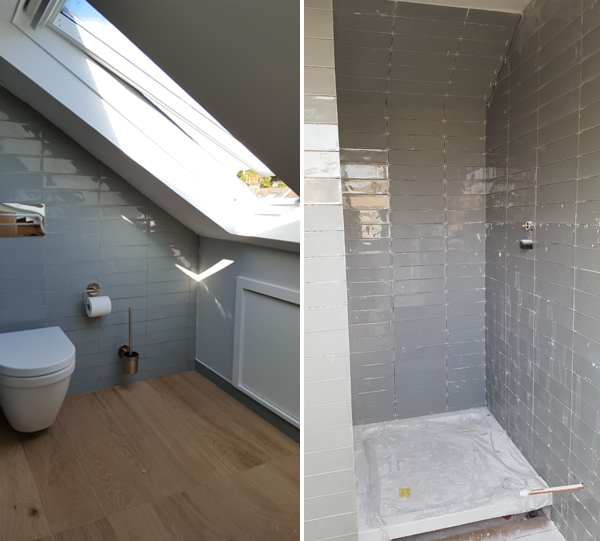
For the en suite bathroom it was decided to replicate, as much as possible, the grey colours on the wallpaper so as to have visual continuity with the bedroom but with a completely modern feel consistent with the use and character of bathrooms nowadays.
The wood look-like tiles matches that of the oak furniture in the bedroom.
The ambition above all these considerations was to create a mood of lightness; freshness and a sweet but very light romanticism reminiscent of British period rooms.
The photographs will give you an idea of how the works are developing though the furnishing is still in process.

Above all, the ideas, intentions and hopefully, achievements for these rooms were developed by thinking of colour and the power of its creative presence.


